Tools of the GeographerMapsA map is the fundamental tool of the geographer. With a map, one can illustrate the spatial distribution (i.e., geographic pattern) of almost any kind of phenomena. Maps provide a wealth of information. The information collected to create a map is called spatial data. Any object or characteristic that has a location can be considered spatial data. Maps can depict two kinds of data. Qualitative map data is in the form of a quality and expresses the presence or absence of the subject on a map, like the kind of vegetation present occupying a region. Quantitative map data is expressed as a numerical value, like elevation in meters, or temperature is degrees celsius. There are many different kinds of maps that serve quite different purposes. Types of MapsReference MapsReference or navigational maps are created to help you navigate over the earth surface. These kinds of maps show you where particular places are located and can be used to navigate your way to them. A street map or the common highway road map falls into this category. Thematic MapsThematic maps are used to communicate geographic concepts like the distribution of densities, spatial relationships, magnitudes, movements etc. World climate or soils maps are notable examples of thematic maps. There are five common techniques for depicting geography data on a thematic map. The most common is a choropleth map that uses color to show variations in quantity, density, percent, etc. within a defined geographic area. Each color usually depicts a range of values.
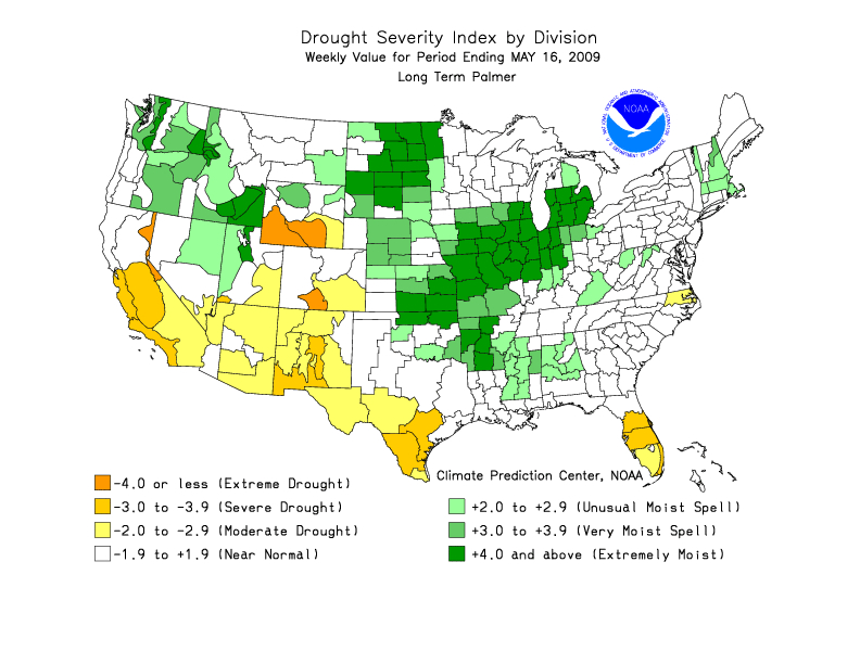
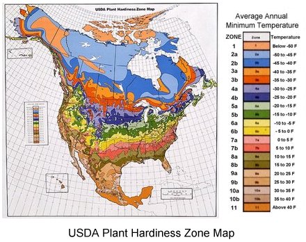
Figure 1.12 Palmer Drought Index Defined areal units are colored on the Palmer Drought Index map in Figure 1.12 to show the pattern of dryness across the United States. Using administrative units presents a less realistic picture of the pattern of the distribution of natural phenomena. To overcome this, a variant of the choropleth map, the dasymetric map was created. This type of map employs special statistical methods and extra information to combine areas of similar values to depict geographic patterns on the map. The USDA's Plant Hardiness Zone Map is a dasymetric map.
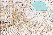
Figure 1.13 USDA's Plant Hardiness Zone Map An isarithmic map uses isolines, lines that connect equal values, to illustrate continuous data such as elevation, air pressure, and precipitation. Topographic maps use contour lines to show elevation (height above sea level). Contour lines connect points of equal elevation above a specified reference, usually as sea level. The heavy brown contour lines with the elevation printed on them are called index contours. Intermediate contours are the lighter brown lines between index contours. Sometimes dashed lines called supplemental contours are used in areas of very low relief. Benchmarks are locations where the elevation has been surveyed. Benchmarks are denoted on a map with the letters "BM", "X" or a triangle with the elevation printed beside.
Not only are natural features like mountains, valleys, streams and glaciers portrayed, but cultural features as well, like houses, schools, streets, and urbanized areas. Examine a topographic symbol sheet (pdf file) from the USGS to see how a variety of features are symbolized on a topographic map.
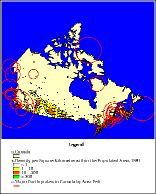
Figure 1.15 Major earthquakes felt in Canada. Source: NAISMap WWW-GIS Proportional or graduated circle maps are another way of depicting geographic information on a map. Figure 1.15 is a map that shows population density of Canada as colored polygons and the distribution of major earthquakes felt throughout the country. Graduated circles indicate the area over which the earthquakes were felt. This map was created using a geographic information system which has the capability of overlying different kinds of spatial data to show the relationships between them.
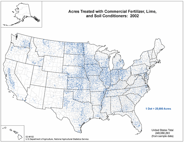
Dot maps use dots to illustrate the presence of the phenomenon on a map. A dot may equate to one or several units of measurement. Dot maps are especially useful in visualizing the frequency of occurrence or density of a mapped variable.
Figure 1.16 Dot map of agricultural chemical use (Source: USDA)
|
For Citation: Ritter, Michael E. The Physical Environment: an Introduction to Physical Geography.
Date visited. https://www.thephysicalenvironment.com/
Please contact the thePitts (host) for inquiries, permissions, corrections or other feedback.
Lisa Pitts (host@thephysicalenvironment.com)
Help keep this site available by donating through PayPal.
![]()
This work is licensed under a Creative Commons Attribution-ShareAlike 4.0 International License..